If you thought that we were living in a golden age of technology, just wait until you see what's around the corner. It's fun to think back on where we were just a few years ago and it's positively mind-blowing when you stop to consider how far things have progressed. Sometimes, I have to remind myself that it was a mere 15 years ago that the first iPhone was born, changing the landscape forever with its touchy-feely interface. Today, touch screen devices feel like they've been around forever– old hat even. Babies take to them like a duck to water and older kids will sometimes ask you what iPads were like when you were younger, only to reel back in shock when you (mic drop) tell them that they didn't even exist.

Motion simulations are helping us to more easily understand complex data.
Data visualisation has been in existence far longer- it's evolved with the technology, coming on in leaps and bounds as computers have increased in power and the browser has evolved into something more joyous from its stilted beginnings in the days of internet explorer. But have we had that iPhone moment yet? A technological leap so mind blowing that it changes the game? If we're talking about data visualisation then the answer is probably, no... not yet.
It's much easier to visualise the world when we can move in three dimensions.
Whilst charts and graphs have got prettier, maps have grown in resolution and artificial intelligence is providing new insights, we still (for the most part) look at data on a page. Even the most visual elements, such as maps, can struggle in this limited dimension.
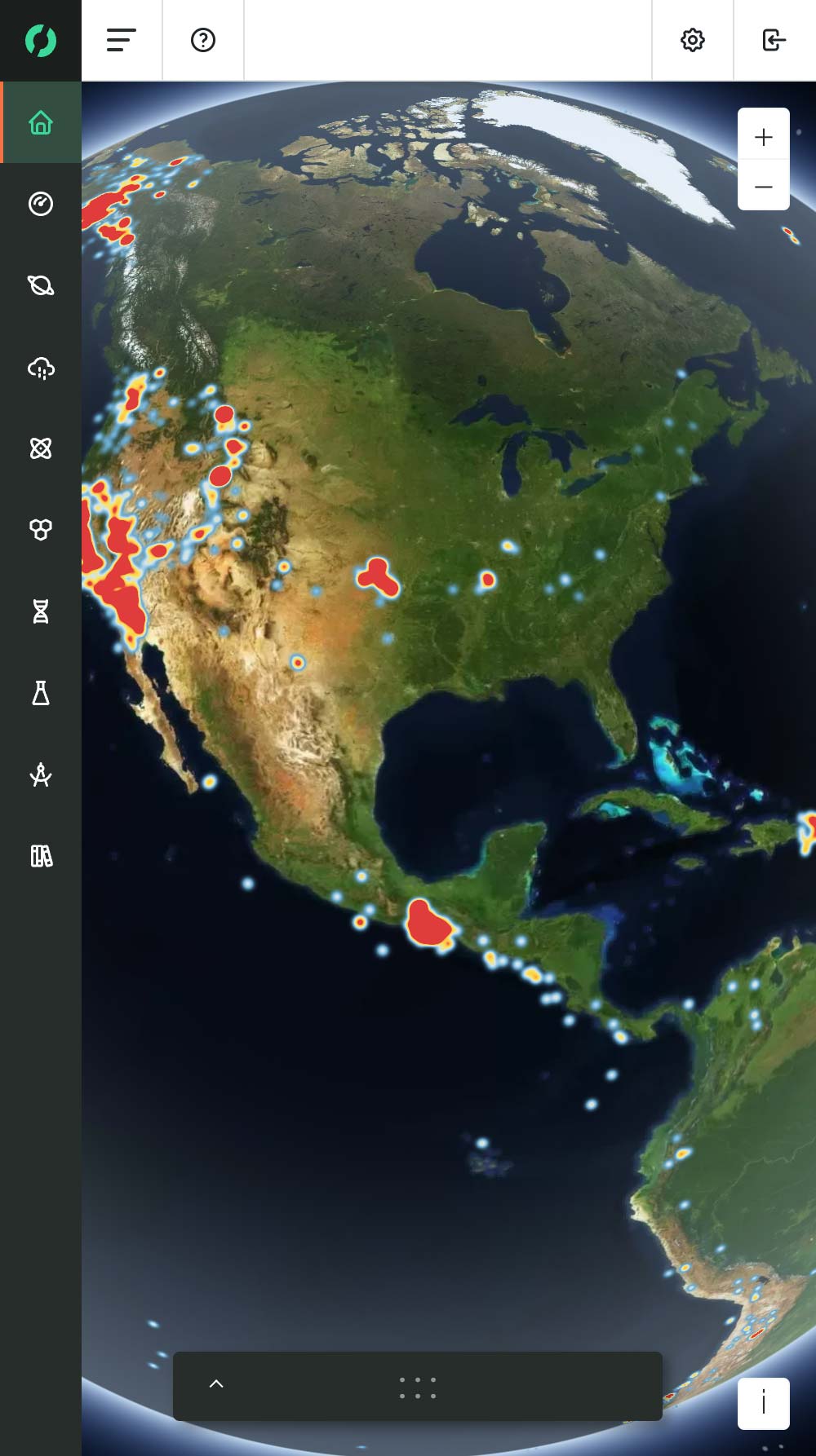
Remember the first time you looked for where you live on Google earth? For a lot of people, despite knowing a place incredibly well (perhaps living there all of their lives) the satellite bird's eye view can seem oddly unfamiliar. Most humans spend the majority of their lives on the ground, so it's hardly surprising that they suddenly lose their bearings when confronted with a 2D top-down view of something they see every day. Take regular old paper maps for instance; the kind your parents used before mobile phones. Some people could read them, but for a lot of people, it meant countless hours lost on country roads, rotating that map until something looked familiar.
Like the transition from paper maps to Google (with directions no less), data visualisation is slowly emerging from the page and venturing into new dimensions.
The team at Fizzee work with a lot of ocean data and it's been refreshing of late to see some of these advances come to the forefront. Motion simulations can suddenly make looking at the flow of currents more intuitive, 3D technologies are starting to open up our understanding of data in ways that mimic how we perceive reality.
Virtual reality and augmented reality may have been around for a little while now, but we're only just beginning to unlock the potential of these new tools, especially in the arena of data visualisation. Here at fizz.ee, we're excited to be a part of some projects that seek to push this new frontier forward.
If you're a science fiction fan, you'll know how useful those 3D visualisations can be. Take the climax of Star Wars for example... Luke Skywalker and his fellow x-wing pilots know how to destroy the Death Star by looking at a holographic model that shows them the exact location of the critical weakness that will allow them to complete their mission. Imagine if Luke Skywalker had to use a paper map… I don't care how strong he was with the force; I'm pretty sure that the Death Star would still be standing and many more worlds would have gone the way of Alderaan. Data visualisation isn’t quite at Star Wars’ level yet, but it’s about to change forever and maybe, just maybe (unlike Alderaan) it will help us to understand and protect our world in ways we cannot yet imagine.